Design
It has been a long time since I haven't designed anything so the first step was to document myself a lot to be up to date with the current design trends, layouts, and so on. It has been a real pleasure to do this, because I love challenges.
Wireframe
So when I was ready, I began with the wireframe which is really different from the current website you are viewing.the home page has changed significantly from the initial idea. But some component hasn't changed that much.
Colors
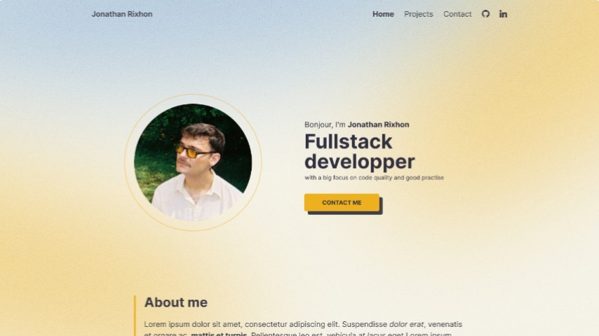
At the beginning of the design I picked two colors. at first I wanted something light and warm so I picked a yello-orange as my primary color. This color is present on my main buttons. The second color was a blue that I used as my secondary color. For the "body" color that I used as my black, I worked with the Zinc colors from Tailwind but I wasn't happy with the white I used for my background because it was a bit too cold and the design looked bland so I added some yellow in it and generated a color palette with the right white.
Font
For my font, I used Inter (google font) because I wanted something modern with an impactful bold variant. This font was perfect for that.
Let's design
At the beginning, I didn't want to show a picture of myself in my hero so I researched abstract shapes to take horizontal space.
After some time, I changed my mind regarding the picture. I thought that a picture of me can improve the user's trust and, thus, increase my chances to be chosen for a project for example.
The shapes were more of a problem than a solution at that time and this looked a bit "has been". So I found a solution that is trendier: Blurry shapes !
for the rest of the design, I give you my drafts and final design links to see by yourself the iterations.
The backend
This portfolio has been made with Laravel (php).
To begin with I wanted to learn something from my portfolio. I explored some ways online to make admin interfaces, and I discovered Laravel Filement and I watched the entire series on Laracast about it. I was very surprised of how simple it was. I Also discovered larave-shift/blueprints that I used to create the structure of my database and my models.
My admin panel is made from three main content categories.
The first one is "Works", this section is shaped like a traditionnal "blog post" section with a little twist. Each work is related to many technologies, those technologies are related to a single discipline (frontend, …). I also made a custom field named slug, that updates its value based of title.
I had a problem with the rich editor. This problem is that the links I put inside it do not have `target="_blank"`.
The second part is the pages section. I made a custom field rendering system to have various layouts for each pages (home, works, contact) so my website is entirely customizable.
The third section is made up of three resources: discipline, technologies, and company. This last one is made to reference the company that made the work I'm referring to.
The frontend
For the front end, nothing really complicated. I used simple HTML, CSS and JS to make all. The only part that was a bit tricky is the contact form section. I made an API with Laravel and I made validation on submit but it was really quick to make.
I really enjoyed making the blurry background which is a simple css animation. But the main effect was the dot that followed the mouse, to avoid performance issues, I make a mousemove event with a debounce to it. The rest is a blurry div that is moved with the event.
Conclusion
I am really proud of this project, created it really quickly and in a way that i really liked. The challenges that I wanted to beat made me stronger in design and I learned a new way to create admin interfaces.
Special thanks to the Whitecube team !